OVERVIEW
Ageism and outdated social norms have led many older adults in both rural and urban communities to feel isolated and marginalized.
According to a study published by UCSF, more than 40% of seniors experience feelings of loneliness and isolation. As a part of Davis Design Interactive, a student-run design group at UC Davis, our team worked to develop a solution to this pertinent issue as a part of Aging 2.0's Grand Challenge.
In seven weeks, our group validated a collaborative-making concept, using technology to enable quality time and to bridge the physical distance. The concept resulted in Half and Half, an app where people can create sessions to collaboratively make things like recipes and craft projects. Each participant receives a different half of the instructions needed to complete their task, encouraging cooperation and communication.

Virtual Demo of Half and Half
Half-and-Half was awarded ‘Most Innovative UX Design’ at Davis DI Presentation Day by Daniel Amara, lead UX designer at Fitbit. All names have been changed to protect interviewee privacy.
PROBLEM
A Timely Issue
In addition to experiencing high rates of loneliness and feelings of isolation, seniors are considered “at risk for severe illness” upon contracting COVID-19 by the CDC, a factor that seriously limits opportunities for seniors to socialize and stay in touch with friends and family.
As a team, we felt strongly about addressing this timely dilemma and chose to start work on developing a product or initiative that could help seniors feel a sense of belonging and community.
Our high-level goals were to:
- Create a platform where seniors can strengthen their interpersonal relationships.
- Allow seniors to socialize in familiar ways while staying at home.
- Make design decisions with accessibility for seniors in mind.
OUR TEAM
Role and Responsibility
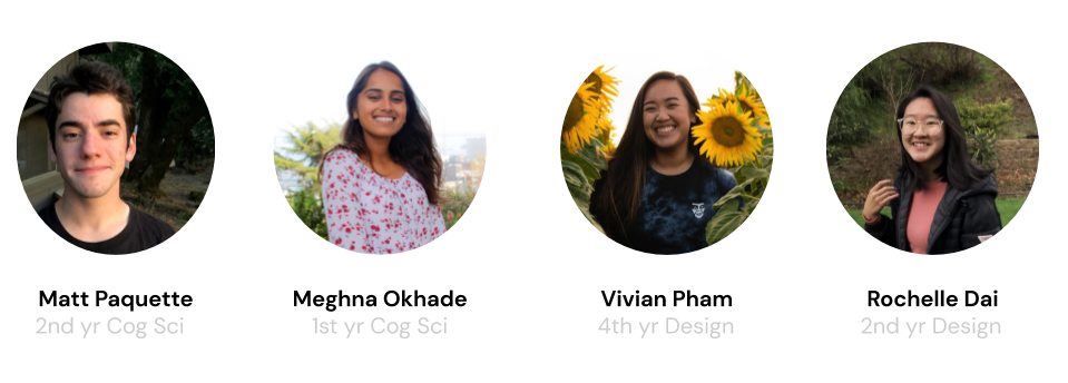
Half-and-Half is the result of seven weeks of work, conducted remotely over Zoom calls with a team with diverse interests and expertise. I collaborated with 3 other students to present a solution that addresses loneliness amongst seniors. My role involved prototyping and conducting user testing and research that led to changes in our final design, improvements on developing wireframes, more cohesive user task flows and adding interactive design elements.
USER RESEARCH
Interviewing potential users gave the strongest insights to our target audience
Before working to develop a solution, our team first worked towards understanding the needs and concerns of our target audience. After conducting online research and sending questionnaires to our target audience, our team collectively felt that conducting in-person interviews would be a much stronger way to gather information and understand the needs of our target audience, especially considering how intense and personal loneliness can be.
Our team developed our most important insights when we scheduled an interview with Steven, a recently retired member of the Davis community.

Before working to develop a solution, our team first worked towards understanding the needs and concerns of our target audience. After conducting online research and sending questionnaires to our target audience, our team collectively felt that conducting in-person interviews would be a much stronger way to gather information and understand the needs of our target audience, especially considering how intense and personal loneliness can be.
Our team developed our most important insights when we scheduled an interview with Steven, a recently retired member of the Davis community. We noticed three main themes:
Importance of Quality Time
Steven mentioned that he enjoyed calling his son on the phone as a means to socialize, but noted that this experience was entirely different compared to spending “quality time” with his son. He also mentioned that he misses cooking meals for friends and having conversations over dinner.
Distrust of Social Media
Steven mentioned that he had recently created a Facebook account, but was uncomfortable with the fact that anyone was able to look him up and send a friend request.
“I see all these people, strangers I don’t even know. Like somebody I knew once that I met. That I have no contact with. And it’s kind of spooky. How did they get through to my social media?”
Feeling Lonely Even When Surrounded by Others
Steven lives with a few college-age housemates but still feels lonely because he lacks common interests with those in his immediate environment. Steven noted that he feels most connected with others when they share common interests and similar perspectives.
BRAINSTORMING
How Might We?
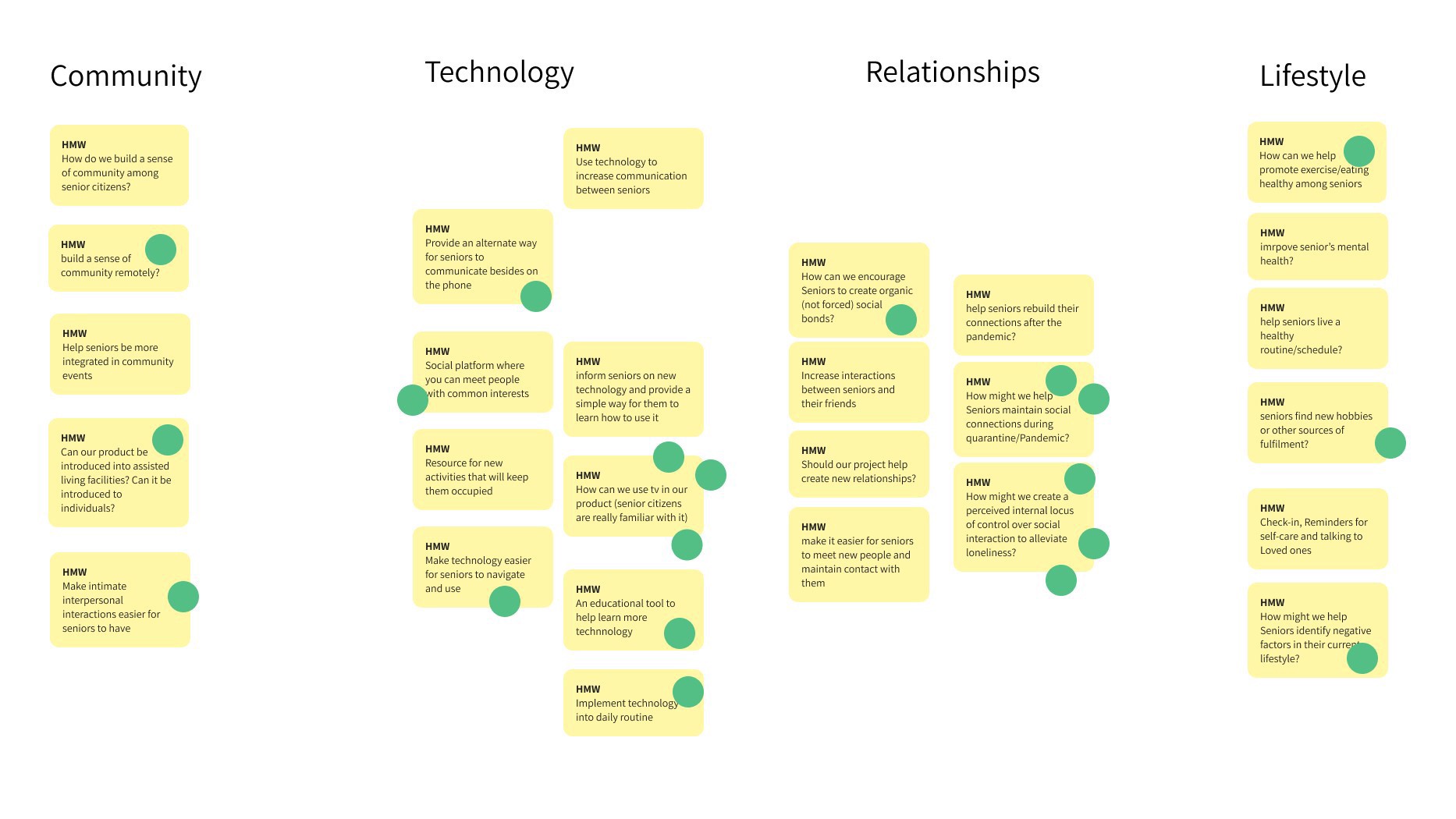
Virtual affinity mapping in Figma in order to brainstorm broad solutions that address loneliness.
To conclude this initial research phase, our team began the process of tackling the broader concept of addressing loneliness by narrowing our focus through the development of three different problem statements.
IDEATION
Visualizing Our Insights
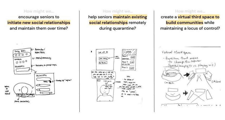
Brainstorming different solution spaces to address loneliness through concept sketches.
Each team member then developed concept sketches for potential ways to address each problem statement. Before building on any sketch, our team developed some guidelines in order to ensure that our product would best fit the needs of a user like Steven.
After deliberation, our team felt that an early Half and Half sketch (then called Cook with Me) would best address these considerations, and we began building our product.
CONCEPT TESTING
Will The Idea Work?
Our next step was to further ideate Half and Half in terms of its capabilities and proposed architecture. Through conceptual testing among our team, we sought to answer these pending questions:
- “Does Half and Half create opportunities to socialize?”
- “What activities would best compliment the split-instruction concept?”
- “Should each user get half of an instruction set, or should users continuously alternate between each instruction step until the list is over? Is one or the other more conducive to meaningful conversation?”
We then completed four different tests: two testing sessions to try out origami, and two sessions to try cooperative cooking. In pairs, each group would be sent modified instructions and left to complete the activity over Zoom call while the other pair observed the activity and took notes.
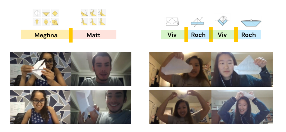
Concept testing of Half-and-Half amongst ourselves with origami.

Finished product of the omelette recipe used for the cooking portion.
USER TESTING
The concept proved to be viable to us but we needed more opinions
After testing amongst our group, we wanted to take it a step further to make sure that the concept would fit within the interests of our targeted audience. In this step, we wanted to answer a new set of questions geared more towards our audience such as:
- "Is the technology behind the concept simple and accessible to our users?"
- "Can communication between two individuals be self-initiated?"
- "Are there any moments of frustration?"
We had each member of the group try out the concept with a senior member of their community. From there each pair would share a dish to cook together over zoom or facetime, to mimic the video call functionality of our concept.
A/B Testing
To gain more insight into instruction organization, we conducted an A/B test for the two different instruction formats—Group A with alternating instructions, Group B with instructions split in half—for the same model airplane. Our testing pool of 20 pairs was evenly randomized to receive one of the two options.

Origami instructions split in two ways.
TESTING TAKEAWAYS
Our team had a lot of fun with testing! As we hoped, the added vulnerability of being reliant on a partner to understand sometimes complicated instructions facilitated lots of laughter and side conversation. These moments were also shared between many of the user testing sessions with additional quirks. We made the following changes to address concerns during our sessions.
Concept Testing
- Include written text instructions
Some steps were hard to describe to our partners because we didn't know the proper wording. Because users can demonstrate each step visually, having only an image doesn't help in the process of explaining. This also addresses individuals who may have a hard time seeing or bad connection to rely on verbal cues instead. - Integrate a "thumbs up" verification system
This allows users to continue onto new steps, even with messy hands. With cooking sometimes the user would need to drop what they were doing just to move onto the next step. With a hands free verification system, users can move onto the next step without leaving their station and cooking midway.
User Testing
- Split instructions in halves, as opposed to providing users with alternating steps
From our user test sessions, Group A, who had the instructions split in half, had a better overall experience and completed their tasks more efficiently and easily than Group B who often struggled and missed steps. Our team agreed that having each partner “take the wheel” for a larger period of time streamlined the activity completion process more so than having partners constantly switching between listening and communicating instructions. - Include a hint button
This would allow the partner without instructions to see instructions for the current step, and would unlock after a set period of time. With origami, we found that some had trouble understanding how to complete certain folds and became confused, making it difficult to explain the step to their partner who was more experienced. If they were stuck for too long, allowing the partner to see the instructions for the step would help us avoid future frustration. - Focus on personal interaction rather than technological functions
During our sessions with our senior audience, some stated that it was "silly and troublesome" to learn new technology to do tasks they could do in person. Similar to Steven, they seem to share the fear of technology that leads to a distrust of social media. So we removed any extraneous features of social media and focused solely on integrating our activities into something they are more familiar with, like video calls.
LOW FIDELITY PROTOTYPING
Our first steps to creating a minimum viable product
Following the drafting of some features, we created some prototype screens in a collaborative Figma doc. We initially designed for a vertical, mobile app.
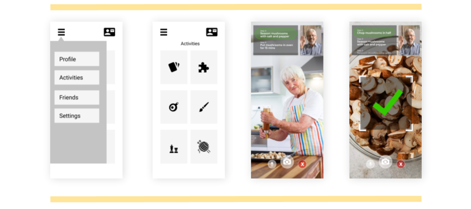
Low fidelity wireframes, with options to choose an activity and start a video call.
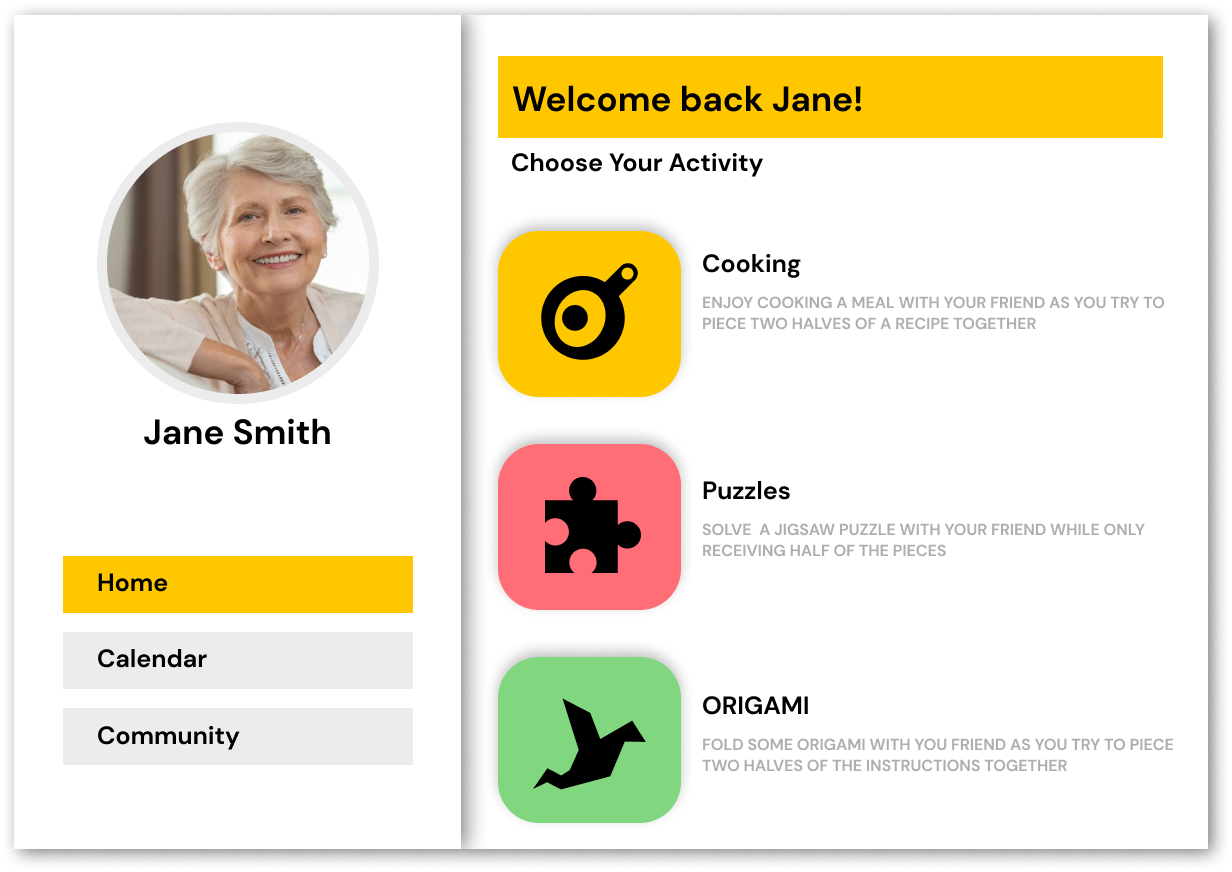
After creating these prototypes, we felt that we wanted to minimize the scope of our app as a means to more effectively show off the “gimmick” of the split-instruction system. Originally, users could choose from one of six social activities on the homepage. We narrowed this down to three activities — cooking, origami, and puzzles — all of which we knew could work within the confines of our existing split-instruction system without heavy modification.
As an example, adding card games to the app was proposed but ultimately reconsidered, as we could not come up with a way to “split” the activity, and felt that the act of playing a competitive game did not align with our goal of creating a collaborative platform.
HIGH FIDELITY PROTOTYPING
Design Layout and Concept
After our user testing sessions, we went back and did more research regarding designing for seniors and implemented actional insights from our sessions. Our first major design change was switching from a phone to a tablet design, as seniors make up the largest population of iPad users.
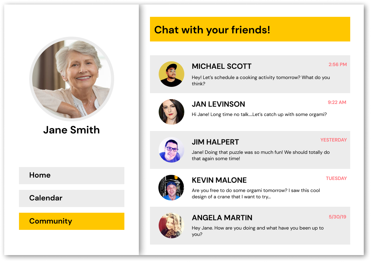
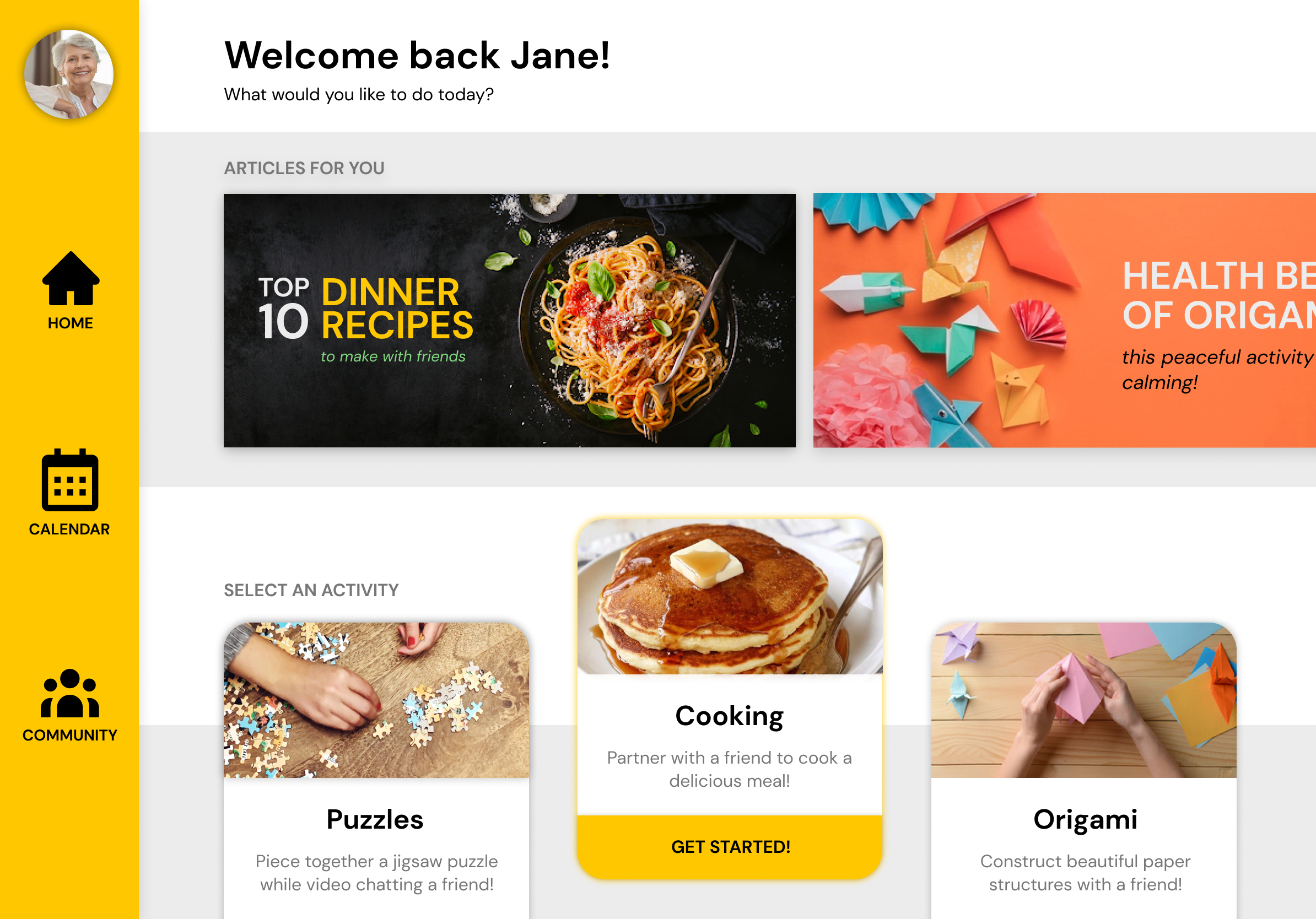
Initially, we considered implementing a “community” feature reminiscent of social media platforms but decided that we wanted our app to be defined by the collaborative nature of its activities rather than as a social media platform. As opposed to users creating a profile and “friending” other users, we decided that users should choose their activity partners directly from the contacts stored on their mobile device. We thought back to Steven’s concern over being found by people he didn’t recognize on Facebook and felt that this solution would give users more control over their network of activity partners.
Accessibility and Interaction
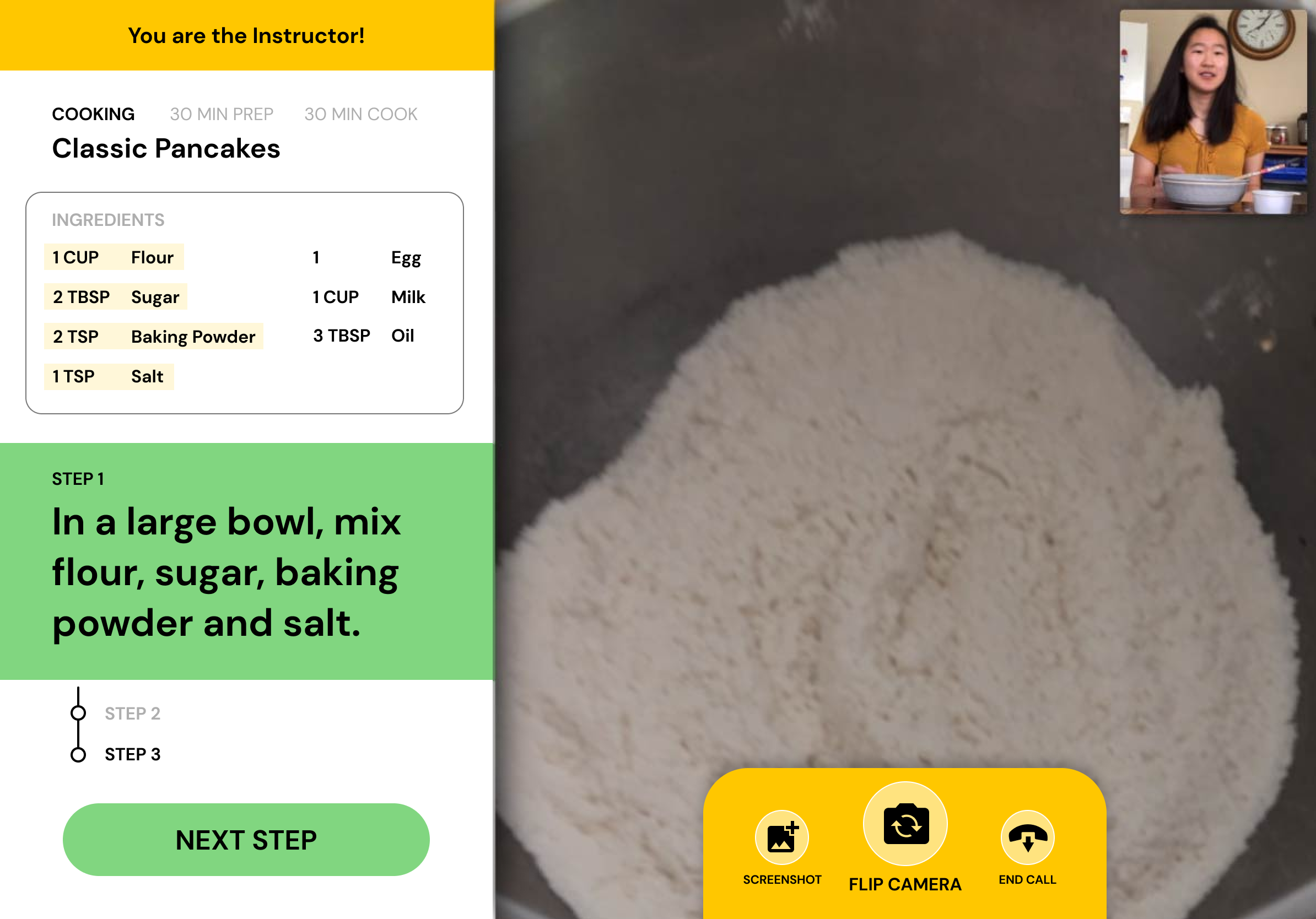
High fidelity wireframes in an iPad format, designed for simple visibility and usability.
We learned that image overlays, abstract icons, and the color blue should be avoided, so we implemented larger visuals and subtitles, along with moving recipe instructions to a static side panel to avoid overlapping of video and text. We changed the hamburger menu to a static sidebar with medium-sized icons and subtitles to avoid “hiding” content and to prevent any ambiguity or confusion created by minimal, abstract icons. After receiving user feedback, we also redesigned the homepage to be more interactive and engaging by including more content such as articles and activities.
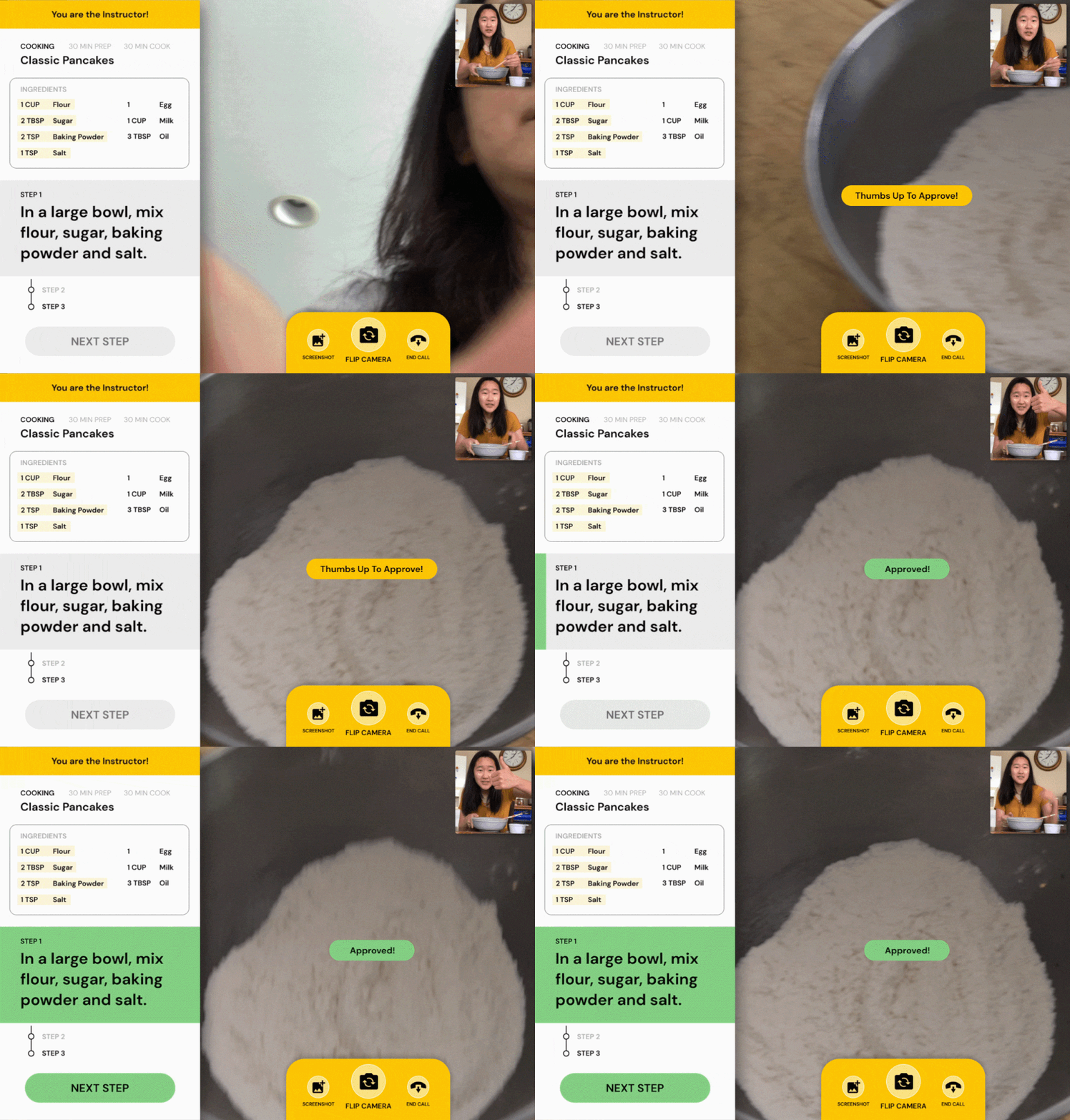
Thumbs-up approval system to limit touch interactions during cooking.
Positive Feedback
Once the activity ended, we wanted to find a way to continue fostering the connection between everyone. To further enhance the user experience, the end of each call was met with a closing page that offers users to further the conversation and view highlights of their screenshots taken during the call.
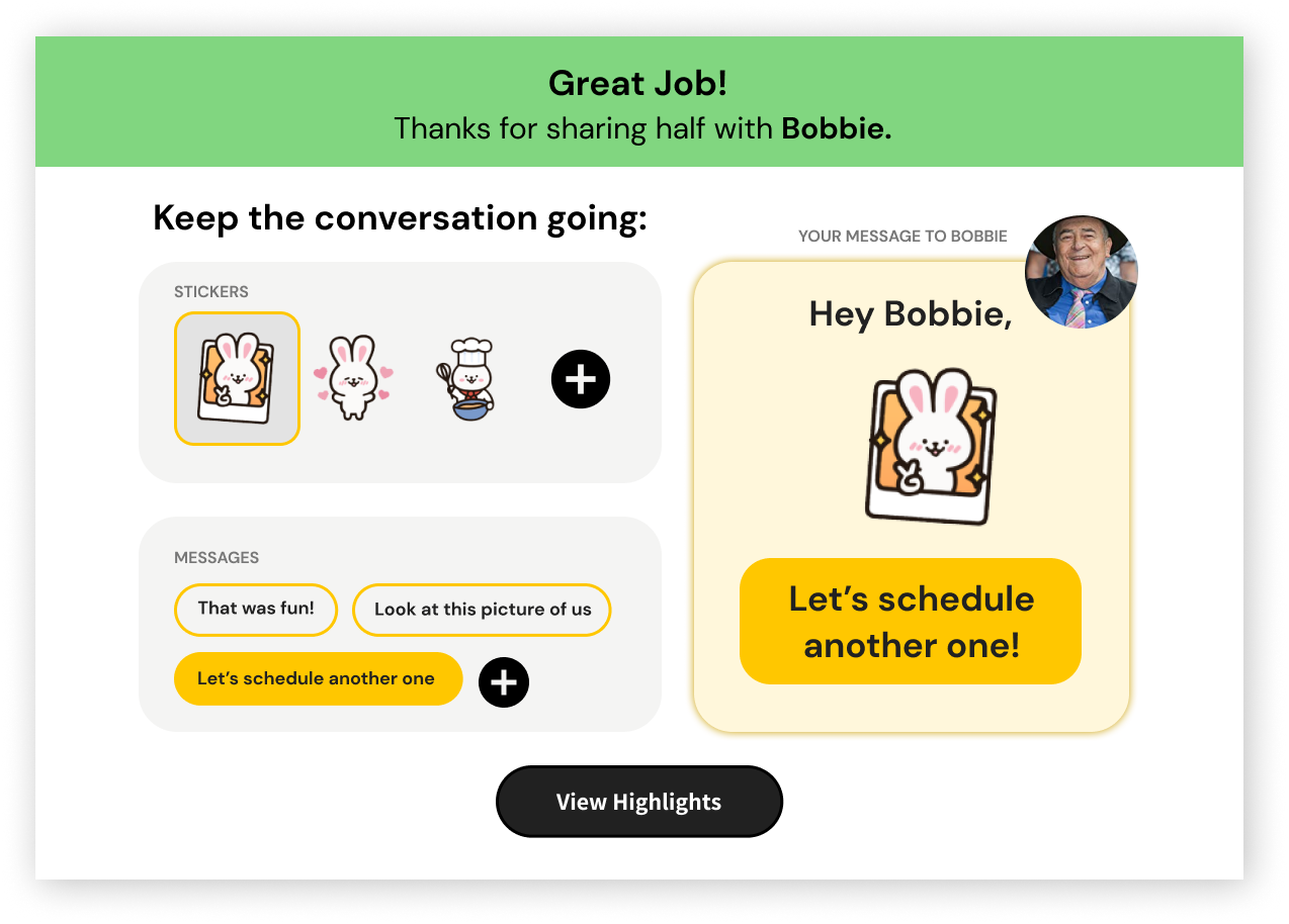
Call ending screen to foster further connections and dialogue.
TAKEAWAYS
Designing for another demographic
As members of a younger generation, we are only exposed to platforms we find accessible and visually appealing to ourselves; our priorities in a platform and product are generally quite different than priorities in senior citizens. We shifted our focus to making heavy research-based design decisions and changes in order to make our app accessible to senior citizens as accessibility became our top priority. Our research motivated many of our choices regarding font sizes, application interface, and design structure, and we learned the importance of concept testing and usability testing when designing for another demographic.
Conducting balanced research
Our interview with Steven was immensely informative in making our design decisions and understanding the needs of our user base. Our survey helped in understanding several users’ needs and wants but did not give us as enriching information as our interview did. During this project, we had to learn how to balance quality and quantity of research methods when working according to a strict timeline. Interviewing more seniors and gaining a more intimate insight to their thoughts would have certainly helped us gain a broader perspective regarding loneliness amongst seniors.
Acquiring user feedback
We believe that our project could have benefited from additional user testing. At the end of the day, the most important thing about Half and Half is that users enjoy and feel compelled to use it. We conducted concept testing amongst a few pair of seniors who enjoyed the activities and idea of interacting with the application but would have liked to get additional feedback on a bigger range in pairing. We believe that further feedback is essential to further developing our project and want to systematically measure participant enjoyment to analyze the effectiveness of Half-and-Half in the future.
CONCLUSION
Our team was proud of our final product and all of the work that we accomplished within seven weeks!
Through rounds of exploration and testing, we were able to validate this novel format that creates a sense of “togetherness,” using technology to bridge physical activity rather than to replace it. In our testing, we found that people valued quality time and enjoyed being able to have time doing something together while seeing each other. We believe in the potential of this form of technology-mediated interaction to solve challenges in senior loneliness, and we hope to explore ways in which we can take this concept further in the future.

